CNN Politics
Rebrand
Sketch, InDesign, Illustrator, Photoshop
CNN Politics Rebrand
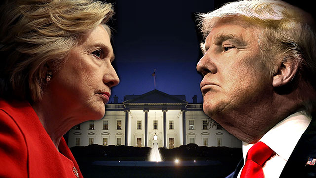
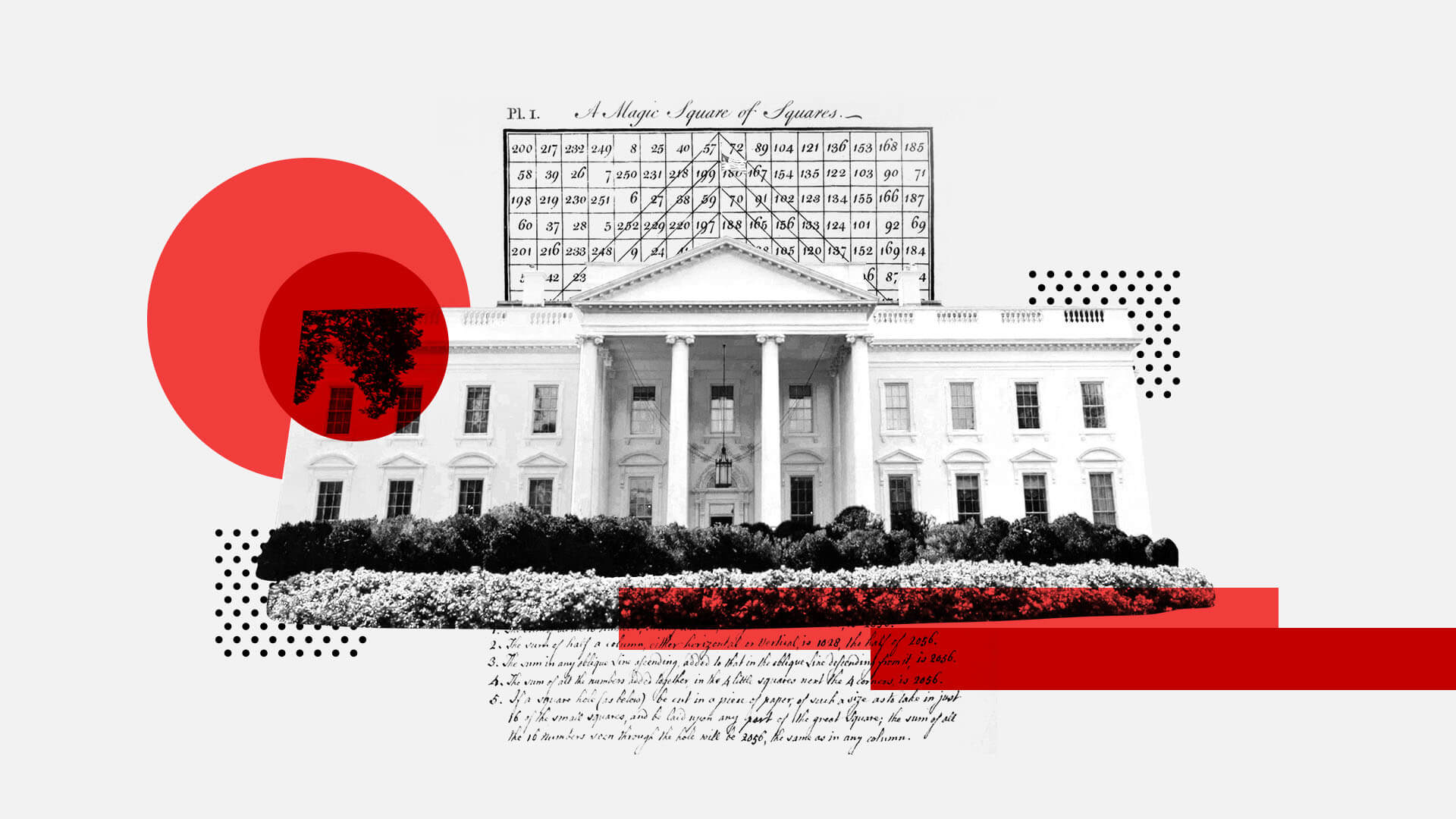
With a new president comes a new style. The last time CNN Politics had gone through a style review was in 2008 when Obama was elected and back then, CNN Politics didn't really exist in the capacity it has become today. Election 2016 had a style that was reminiscent of Star Wars with the blue and red lights against a dark background. My goals for this rebrand: create styles that are respectful of all political views (more neutral or nonpartisan, instead of visually polarizing political parties), while still incorporating CNN TV's overall bold style to Politics.
Overall, I was looking at existing industry and adjacent trends to incorpoate them into Politics style. This rebrand/style update would apply to graphics and illustrations, social media, and Politics web pages.
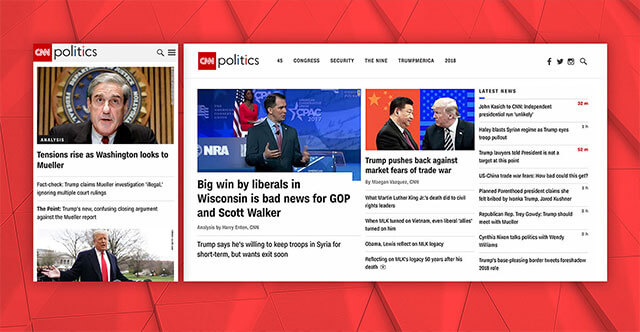
Homepage
I had noticed design issues with the existing homepage and unbeknownst to me, various stakeholders voiced similar thoughts to the product team. In desktop view, the main story's image took up the majority of the space on the page with the headline below it. Depending on the length of the headline, you could only see the first line of text and would have to scroll down to read the rest of the headline.
When you include breaking news alerts, sometimes you could only see the top half of the first line or no headline at all. The nav bar also had an unusually tall height, which again pushed the content even further off the screen. There were a few issues: 1) the most important headline on the homepage was not visibile in the inital view, 2) the image associated with the main headline took up more than half of the available space, especially when the photography was a closeup of someone's face, it was overwhelmingly large, 3) while the main headline was obscured or half-obscured, the secondary headlines to the right were easier to read.
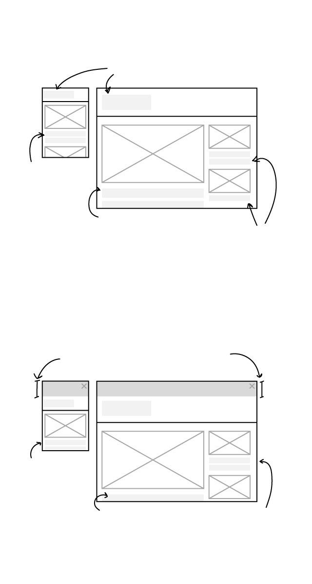
STANDARD VIEW
Unusually large nav bar
height pushes down content
One
headline
viewable
at landing
page in
mobile
Main headline is cut off,
need to scroll in order
to view full headline
Secondary
headlines
in full view
above the fold
BREAKING NEWS VIEW
Breaking news alerts push down
content even further
The one
headline
gets
pushed
down
Main headline is cut off,
need to scroll in order
to view full headline
One secondary
headline in full
view above
the fold
Meanwhile, the mobile view was fine. More image-to-headline ratio than I would have liked, and there was a lack of hierachy between the main and secondary headlines but it worked fine. I sought to improve the layout overall so that all devices would have a positive experience on the homepage and not just mobile.
I began to compile case studies, mainly by taking screenshots of competitor home pages and looking at trending web design overall. There were a number of patterns among the industry-related homepages — newspaper and magazine based companies had three columns of varied widths layout while broadcast tended to have two columns (one of which was usually video-related). It was also easy to notice that the print-based companies seemed to have an easier transition to digital as they were more established when it came to design layout and understood the above-the-fold concept, they were able to maximize the amount of content within the given real estate. On the other hand, the TV-based companies had much more emphasis on providing video experience. With CNN expanding in the digital realm, it made sense to adopt the three column layout as it maximized on the information/news/content-first front. Also, CNN's reputation of being the first when it comes to breaking news on TV, it made sense to have a "latest" news feed of said breaking news.
So the three column layout made sense — main headlines, secondary headlines, and a "latest" news feed. In short, I arrived at the design solution by using case studies — I compiled visual information of competitor homepages, identified best practices, encompassed the new rebrand aesthetics and proposed the idea at a rebrand meeting. The product designers then used my solution as a basis for the current homepage
See the homepage here.
Editorial style
The previous illustration style carried over from Election 2016 season and prior was more purely traditional handdrawn illustrations. But given these illustrations were done within the more daily or breaking news deadlines, naturally the handdrawn illustrations lacked in detail necessary for the full effect due to time constraints. There was also some disconnect between TV and digital editorial styles, the original direction for CNN Politics was to be "more magazine-like" by incorporating handdrawn illustrations while TV continued with TV graphics. For a digital-first organization, the handdrawn illustrations had little digital feel, giving more the impression of print-based media, and with CNN's TV presence so widespread, it made sense to have some visual tieback to that reputation while keeping a distinct feel as many reporters on digital are not on TV and vice versa.
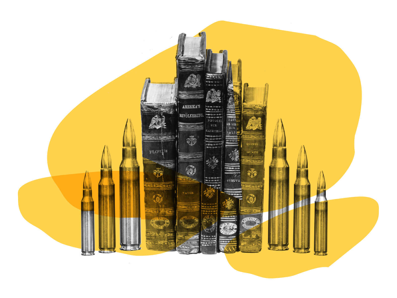
With the considerations above, I took a look at applicable web trends that would work with political subject matter. Finding styles that would work for CNN's editorial stance proved a challenge — the temporal and yet permanent nature of the web combined with the scrutiny CNN receives, we have pushed for a more neutral stance when it comes to illustration. Neutral was a challenge as editorial content hardly says nothing, but neutral could also be resolved by somehow combining oppposing views into one illustration (in an ideal world anyway, there's only so much one can accomplish in 3 hours...). Existing editorial styles involving political figures naturally take a stance and often render the political figure in a cartoonish way, those ideas wouldn't work as neutral. Meanwhile, styles on political subject matter, such as healthcare, equality, and taxes, had more flexibility in style, concept and elements of design to work with (and by elements of design I mean: lines, color, shape, space, etc).
The fact is politics touches on many "great debates" for the contemporary observer. I wanted to find a way to branch out and create a more unique and on-trend CNN Politics style. Not that trendiness matters in Politics (or does it?) but most all media companies had very stoic styles for politic-news content.
See the homepage here.
I compiled previous graphics and illustrations to help inform the styleguide. View "Year in Political Illustrations" live here.